library(tidyverse)
library(readxl)
library(showtext)
library(gganimate)
library(gifski)

date_caption <- "13 janvier 2025"
source("tools/themes.R")

musee_frequentation <- read_csv("posts/2025-01-25/data/antibes-frequentation-musees-france.csv")Introduction
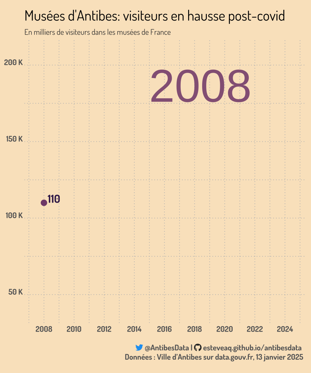
Ce poste analyse le nombre de visiteurs dans les musées d’Antibes depuis 2008. Une animation est réalisée pour illustrer la baisse durant le COVID puis la reprise à des niveaux records. Les musées concernés sont le Musée Picasso et le Musée de l’Archéologie. Le nombre de visiteurs est agrégé sur ces deux musées.
Résultats
La fréquentation des musées atteints des niveaux records suite à la période du COVID-19.
Visualisation
Code
Import
Analysis
# data to draw line geom
dataplot <-
musee_frequentation %>%
  filter(ANNEE>2007) %>%
  group_by(ANNEE) %>%
  summarize(tot = sum(NB_TOTAL_ENTREES))
dataplot
# A tibble: 17 × 2
ANNEE tot
<dbl> <dbl>
1 2008 110068
2 2009 140005
3 2010 138800
4 2011 135151
5 2012 132157
6 2013 137711
7 2014 167305
8 2015 150944
9 2016 131244
10 2017 134775
11 2018 124964
12 2019 142284
13 2020 47237
14 2021 78463
15 2022 160544
16 2023 201000
17 2024 197190# data to draw dot symbolizing the max value at the end of the line
dataplot_max <-
dataplot %>%
filter(ANNEE == max(ANNEE))
dataplot_max# A tibble: 1 × 2
ANNEE tot
<dbl> <dbl>
1 2024 197190#highlight color for plot
highlight <- "#0E2C48"
highlighttext <- "#4B9E8C"
highlightmain <- "#824B79"Plot
# Static Plot for testing
plot_musee_frequentation <-
  dataplot %>%
  ggplot(aes(x = ANNEE, y = tot/1000, group = 1)) + #divided to obtain thousands
  geom_line(size = 1.5, color = "#0E2C48") +
  geom_point(data = dataplot_max, size = 4, color = highlight) +
  scale_x_continuous(breaks = c(2014,2020,2023, 2024),
                     expand = c(0.1, 0.1),
                     )
plot_musee_frequentation
# Animated Plot
# Create a new col to control the speed of the animation
dataplot_slowdown <-
  dataplot %>%
  mutate(
    show_time = case_when(      # Adjust show_time for specific years
      ANNEE %in% c(2020) ~ 10,  # Show these years longer
      TRUE ~ 1),  # Default speed for others
    reveal_time = cumsum(show_time)  # Cumulative time for each point
  )

# Get thousands instead of individual visitors
dataplot_slowdown$tot <- round(dataplot_slowdown$tot/1000, 0)


# Final Plot
plot_musee_anim <-
  dataplot_slowdown %>%
  ggplot(aes(x = ANNEE, y = tot, group = 1)) +
  geom_line(size = 2, color = highlightmain) +
  geom_point(size = 4, color = highlightmain) +
  geom_text(aes(label = paste(tot)),
                vjust = 0, hjust = -0.3, color =  "#3D2358",
                fontface = "bold",
                family = setfont,
                size = 6, show.legend = FALSE) +
  geom_text(aes(
            x = 2016,
            y = max(dataplot_slowdown$tot) - 26,
            label = paste(ANNEE)),
            vjust = -0.05,
            hjust = 0.15,
            color = "#946285",
          #  fontface = "bold",
            size = 25, show.legend = FALSE) +
  labs(y = "Total des visiteurs",
       x = "Années",
       title = "Musées d'Antibes: visiteurs en hausse post-covid",
       subtitle = "En milliers de visiteurs dans les musées de France",
       caption = social_caption2) +
  scale_x_continuous(expand = c(0, 1.3),
                     breaks = c(2008, 2010, 2012, 2014, 2016, 2018, 2020, 2022, 2024)) +
  scale_y_continuous(expand = c(0.1, 0.1),
                    labels = scales::label_number(suffix = " K")) +
  tt
Render
# render
animp <-
  plot_musee_anim +
  transition_reveal(reveal_time) +
  ease_aes()

# render with timing
 a <-
   animate(animp,
           start_pause= 5,
           end_pause = 100,
           fps = 25,
           duration = 10,
           width = 1000,
           height = 1200,
           res = 150        # Set resolution (DPI)
           )

anim_save("posts/2025-01-25/plots/musees.gif", a)
Source
Fréquentation des Musées de France de la Ville d’Antibes, disponible sur data.gouv.fr. Mise à jour du 13 janvier 2025